Just received this from Incoming Evidence, their first eponymously named publication. I’m fairly murky on the details of who is leading IE or their exact intentions, although I suspect that murkiness is intentional, best I understand is this is a curatorial project concerned with aesthetic and style rather than specific content. Lately I’ve often found myself explaining photography as a medium to people by describing a spectrum from pictorialism to photojournalism. One end is almost entirely concerned with the relationship between the image and the real world, the other is concerned with the dynamics of form and tone within the image, caring little about their bearing on reality. With that fairly sloppy diagram constructed, I’d describe this publication as ‘pictorial curation’. This slim volume compiles work from four artists, two photographers with whom I’m familiar; Sam Binymin & Ellen Stewart; Naomi A, an artist working with collage; and Hugo Hagger, a multimedia artist who’s work featured here is primarily drawing.
The small format is embraced wholeheartedly, no white borders and too clever sequencing to ape the photobook here, instead the pages are filled to bursting - opposing works are almost antagonistic, only heightening the stylistic contrasts. Stewarts photographs display a wonderfully muted tonality as is her trademark, bringing with it an ethereality that stands in polarity to the Siskind like richness of Binymin’s photographs. The inkiness of his blacks is insistent, authoritative. A provides a foil to the ‘straight’ photography of Stewart and Binymin, her assemblies of vernacular photographs and other media feels mocking of the elegant pretence of photography, instead bringing it down to the level of any other kind of illustration. Hagger disrupts the put-togetherness entirely, the frantic energy of his drawings is unlike anything else in the book, his subjects fall wherever they may on the page, unmoored from the ties of the frame.
What is remarkable about this publication is not in the merits of any of the artists featured, as talented as they are, there are hundreds of zines that collate fantastic work in such a poor way that they are all lessened as a result. The difference here is that IE is a curatorial project not a publishing one, and clearly great efforts have been expended to ensure that the tremendous amount of tension within is held in balance, and that is a remarkable achievement.
Available Here: https://incomingevidence.bigcartel.com/product/001
Whistling for Owl’s is Max Ferguson’s debut monograph, published by his own imprint, Oval Press. A decade of experience on the other side of the table, in commissioning, editing, and the publication of magazines such as Port & Granta has resulted in an extremely impressive first book. The production is excellent, all aspects considered, from the vivid but not overwhelming orange book cloth, to the glassine corner set into the bindings, or even the choice of Garamond for typesetting, a nod to Ferguson’s French connections.
I’ve had the pleasure of watching Ferguson develop this work over the past year or two in crit sessions. I confess that I was somewhat sceptical at first of his grand ambitions surrounding the interplay of text and photographs. He firmly rejects many of the traditions of photo-textual works, the photographs are not illustrations, nor are the texts captions. A lofty goal, to make a body of work that treads such a narrow line it could be a razor’s edge.
However he has done just that. As you leaf through the pages a story unfolds that depends wholly on the coalescence of both media. In order to appreciate this work you must read the photographs and look at the texts.
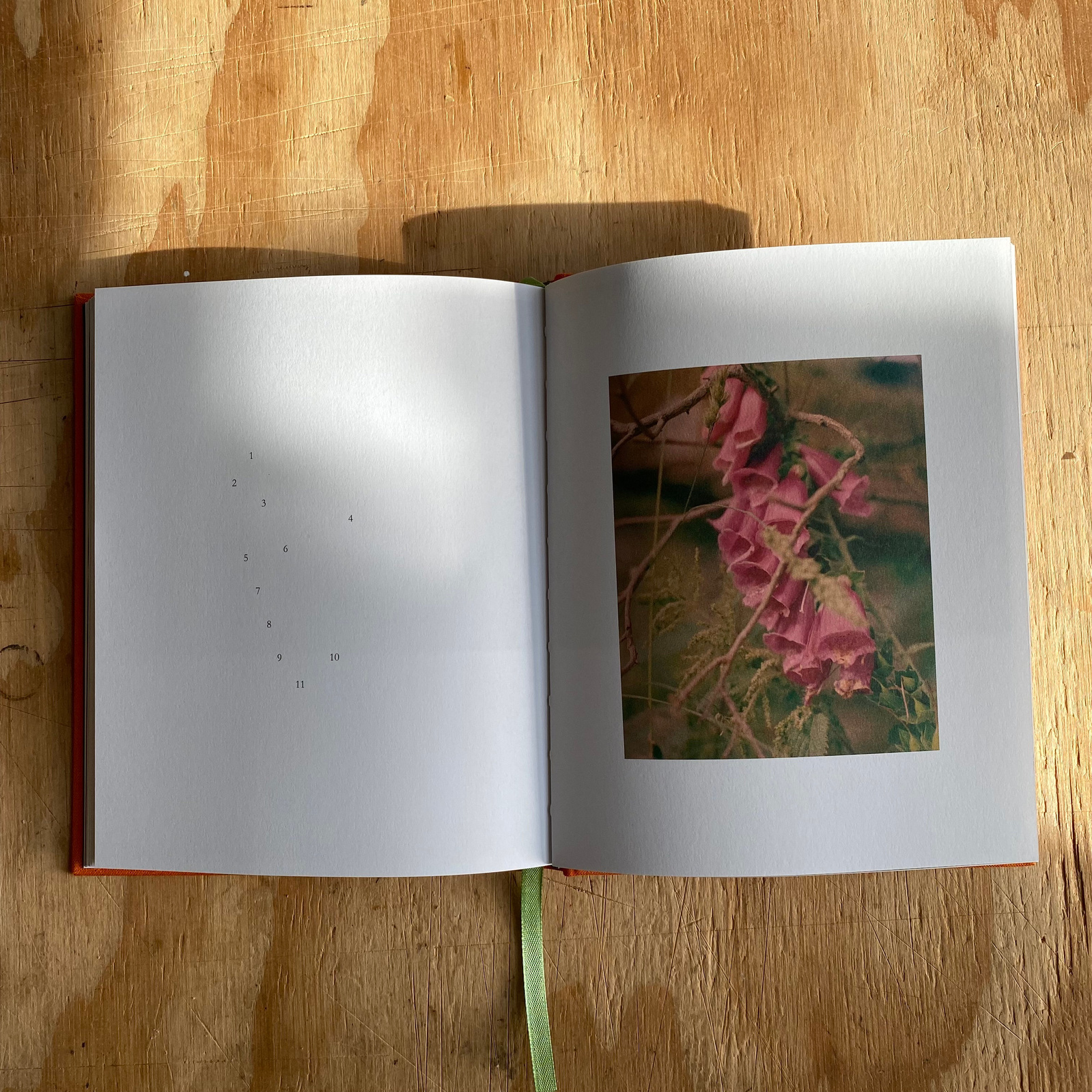
The design is certainly instrumental in this careful balance, beginning with how Ferguson composes a photograph and running through to how he places a word upon the page. When photographing landscapes Ferguson seems to work around the edges, focusing on the areas that go unnoticed or under appreciated. This fondness for roughness perhaps a rejection of the neatness that comes with the more polished world of magazine photography. This bleeds into the technicality of many of his photographs too, scratches and dust are reproduced unchallenged.
His compositions are direct, subjects central and dominant, almost confrontational in their gaze. Whilst these photographs could prove overwhelming in isolation, they’re tempered by the lyrical texts and flowing arrangement on the page. The crushed highlights, muted tonality, and occasionally shifted colour balance also do the important work of bringing some consistency to the eclectic mix of subject matter.
The writing of W.G. Sebald are obviously a major influence on this work, and Ferguson as a whole. The first person narration feels eerily close to that of the author, although perhaps more poetic, more dramatic an existence than can be found in reality. Naturally there is a comparison to be made to Austerlitz, but Sebald’s opus still resides firmly in the world of literature and text - albeit with excellent interaction with photography, whilst as I have previously said, Ferguson treads their division much more closely, leaning towards photography if leaning at all. Sebald’s use of photographs and illustrations as evidence for his storytelling is demonstrated excellently in Whistling for Owls, the ambiguity of the works allegiances allows the text to evidence the photographs as the photographs reflexively evidence the texts.
Available here:
https://ovalpress.co.uk/
The Red River - Jem Southam, 1989, Cornerhouse
This is not my first copy of The Red River, technically. The last copy I bought for seven pounds disappeared into the void that was the postal system at the height of the pandemic. In all honesty that was my main motivator for chasing down a copy a year later, and when I opened the parcel this morning I realised I had absolutely no idea what this book was about.
The Red River documents an area of Cornwall that surrounds a barely documented river, stained red with clay leached out of the earth. A meandering and mysterious survey, much more on the side of poetry than reportage - notably so given the era of documentary photography that this work was made in.
For many people, myself included, their knowledge of Southam’s work begins and ends with The River Winter. In fact the very first photograph I saw in a classroom was the River Exe at Bickleigh, 6 December 2010. The Laura Pannack photograph that followed it in the slideshow made me think Southam was actually a thirty year old woman for longer than I care to admit. This singular focus on The River Winter has resulted in a warped and narrow view of the complex artist that Southam is. Despite the nominative similarities, The Red River needs to be considered in it’s isolation, or as a precursor to The Moth which picks this story up again thirty years later.
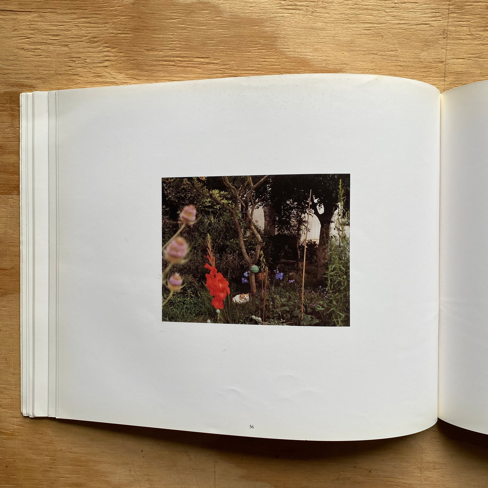
The colour palette of the work is the most immediately striking feature, a surreally vivid yet muted look that is rare outside of Paul Graham’s early work. This palette only heightens the already fantastical colours that Southam finds as he explores this landscape, the stained river is not biblical, rather otherworldly. Rust coursing through the hills. The perspective provided by the view camera is strange here, it feels as if Southam is deliberately working against the objectivity that can be the default with such tools. He leans into a snapshot aesthetic at times, although the acuity of his images betray any real feeling of casual photography, instead the looseness in framing conveys the unique tiredness one feels trudging through the British countryside with a heavy camera and tripod slung over ones shoulder. Southam is undoubtedly a visitor to these parts, as he photographs the pigs (a motif which recurs almost as often as the river itself), he conveys the uneasiness that many of us have surely felt, when in a strange field and discovering the animal which resides there neither sure how the other will react. This same uneasiness can be felt when regarding the houses and towns.
When designing this book Southam chose to divide the photographs into chapters, not chronologically or geographically but based on myths regarding our understanding of the landscape. This chaptering of the work is one of the few features that feel dated, as at least in my experience, dividing work this formally has largely been eschewed as more photographers rely on form and image based sequencing for structure. The frequent and perhaps superfluous chapter breaks seem to stop you from sinking fully into the landscape that unfolds between the pages, although maybe that’s the point? Despite containing almost fifty images, the book feels extremely brief. It’s unsurprising that Southam has chosen to continue photographing this area, and it’s wider surroundings during the thirty years that have passed since he published this book. In his more recent publication Southam appears to have replaced himself as storyteller with an unnamed and fictitious narrator, seemingly another step away from traditional documentary and further into the poetic.


-
Share